
1Manipulation
Ceci afin de parfaire la lisibilité de l’ensemble de la navigation présente dans le footer (bas de page) – les liens contact, mentions légales, politique de confidentialité, …
- Ouvrir index-ALL.html dans firefox
- Ouvrir monstyle.css dans notepad++
- Ligne 54 ajouter le commentaire
/*FINITIONS*/ - Ligne 55 ajouter
footer li {
display: inline;
}
Explications > ne sont ciblés que les élements de liste
<li>présent dans un<footer>.
Altération du rendu (display) de typeblockdes éléments de liste afin qu’ils adoptent un renduinline, permettant à chaque élément de se suivre sur une ligne horizontale.
[Dans Firefox – Actualiser la page pour constater les modifications apportées] - Ligne 58 ajouter
footer li::after {
content :"/";
padding: 0 0.1em 0 0.3em;
}
Explications > ne sont ciblés que les élements de liste
<li>présent dans un<footer>.
Demande d’ajout de contenu (content : "/";) après un<li>>li::after.
(Ce contenu est une barre de fraction – slash – afin de séparer à l’œil les différents liens proposés.)
[Dans Firefox – Actualiser la page pour constater les modifications apportées] - Ligne 62 ajouter
footer li:last-child::after {
content :"";
padding: 0;
}
Explications > ne sont ciblés que les élements de liste
<li>présent dans un<footer>.
Suppression du contenu – slash – précédemment demandé (content : "";) après le dernier<li>>li:last-child::after.
(Ce contenu est une barre de fraction – slash – afin de séparer à l’œil les différents liens proposés.)
[Dans Firefox – Actualiser la page pour constater les modifications apportées]
- Ligne 54 ajouter le commentaire
2Observation

Avant modifications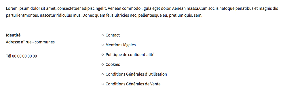 Après Modifications
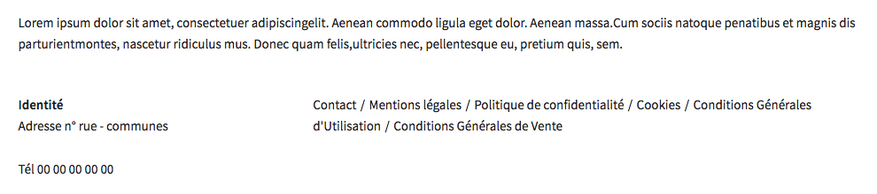
3Le code de cette étape
monstyle.css
@import url('https://fonts.googleapis.com/css?family=Oswald|Source+Sans+Pro:300,400,600');
/*
font-family: 'Source Sans Pro', sans-serif;
font-family: 'Oswald', sans-serif;
*/
body {
font-family: 'Source Sans Pro', "Helvetica Neue", Arial, Helvetica, Geneva, sans-serif;
}
h1, h2, h3, h4, h5, h6 {
font-family: 'Oswald', "Lucida Grande", Lucida, Verdana, sans-serif;
}
#logo {
width: 86px;
height: 90px;
background-image: url('../images/logo/brandx_logo-petit.png');
background-position: center center;
background-repeat: no-repeat;
margin: 0 auto 1em;
}
 /* Add a black background color to the top navigation */
.topnav {
  background-color: #333;
  overflow: hidden;
}

/* Style the links inside the navigation bar */
.topnav a {
  float: left;
  display: block;
  color: #f2f2f2;
  text-align: center;
  padding: 14px 16px;
  text-decoration: none;
  font-size: 17px;
}

/* Change the color of links on hover */
.topnav a:hover {
  background-color: #ddd;
  color: black;
}

/* Add an active class to highlight the current page */
.active {
  background-color: #4CAF50;
  color: white;
}

/* Hide the link that should open and close the topnav on small screens */
.topnav .icon {
  display: none;
}

/*FINITIONS*/
footer li {
display: inline;
}
footer li::after {
content :"/";
padding: 0 0.1em 0 0.3em;
}
footer li:last-child::after {
content :"";
padding: 0;
}

@media (min-width: 801px) {
#logo {
width: 234px;
height: 100px;
background-image: url('../images/logo/brandx_logo.png');
background-position: center center;
background-repeat: no-repeat;
margin: 0 auto 1em;
}
}

@media (min-width: 550px) {

.bureauGauche {
margin-left: 0;
}
.bureauDroit {
float: right;
}
/*.bureauDroit {
position: absolute;
right: 0;
}*/
.imgGauche {
float:  left;
margin-right: 4%;
}
.imgDroit {
float:  right;
margin-left: 4%;
}
.imgCentre {
text-align: center;
}
.imgBandeau {
width: 100%;
height: 400px;
background-image: url('../images/imgDemo01.jpg');
background-position: center center;
background-repeat: no-repeat;
background-size: cover;
}

}

 /* When the screen is less than 800 pixels wide, hide all links, except for the first one ("Home"). Show the link that contains should open and close the topnav (.icon) */
@media screen and (max-width: 800px) {
  .topnav a:not(:first-child) {display: none;}
  .topnav a.icon {
    float: right;
    display: block;
  }
}

/* The "responsive" class is added to the topnav with JavaScript when the user clicks on the icon. This class makes the topnav look good on small screens (display the links vertically instead of horizontally) */
@media screen and (max-width: 800px) {
  .topnav.responsive {position: relative;}
  .topnav.responsive a.icon {
    position: absolute;
    right: 0;
    top: 0;
  }
  .topnav.responsive a {
    float: none;
    display: block;
    text-align: left;
  }
}