
1Manipulation
Depuis Firefox…
- Se rendre sur fonts.google.com
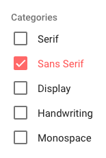
- Haut gauche de l’écran > Catégories > ne sélectionner que Sans Sérif
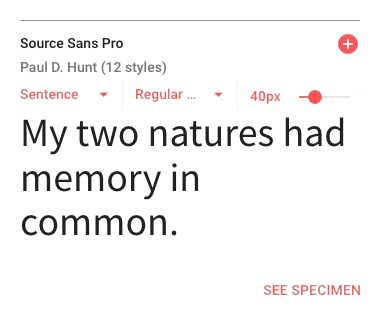
- Sélectionner la police Source Sans Pro pour le corps du texte
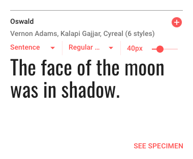
- Sélectionner la police Oswald pour les titrages
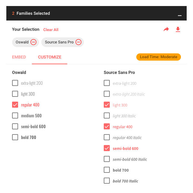
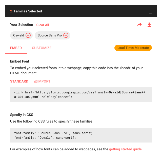
- En bas de l’écran > Ouvrir l’onglet (2 Families Selected)
- L’onglet ouvert > Sélectionner Customize > Colonne Source Sans Pro > Ajouter light 300 + semi-bold 600 à regular 400
- L’onglet ouvert > Sélectionner Embed
- Option STANDARD > Copier
<link href="https://fonts.googleapis.com/css?family=<span class="collection-drawer-emphasized-code">Oswald|Source+Sans+Pro:300,400,600</span>" rel="stylesheet"> - Dans Notepad++ > index-ALL.html > Ligne 25 > Coller
<link href="https://fonts.googleapis.com/css?family=Oswald|Source+Sans+Pro:300,400,600" rel="stylesheet"> - Option STANDARD > Copier
font-family: 'Source Sans Pro', sans-serif;<br>font-family: 'Oswald', sans-serif; - Dans Notepad++ > monstyle.css > Ligne 1 > coller et commenter
/* font-family: 'Source Sans Pro', sans-serif; font-family: 'Oswald', sans-serif; */<span id="mce_marker" data-mce-type="bookmark" data-mce-fragment="1"></span>
- Option @IMPORT > Copier le fragment de code >
@import url('https://fonts.googleapis.com/css?family=<span class="collection-drawer-emphasized-code">Oswald|Source+Sans+Pro:300,400,600</span>'); - Dans Notepad++ > monstyle.css > Ligne 1 > coller
@import url('https://fonts.googleapis.com/css?family=<span class="collection-drawer-emphasized-code">Oswald|Source+Sans+Pro:300,400,600</span>');
2Le code de cette étape (1/2)
index-ALL.html (fragment – le <head> – ligne 3 à 32)
<head>

  <!-- Basic Page Needs
  –––––––––––––––––––––––––––––––––––––––––––––––––– -->
  <meta charset="utf-8">
  <title>Your page title here :)</title>
  <meta name="description" content="">
  <meta name="author" content="">

  <!-- Mobile Specific Metas
  –––––––––––––––––––––––––––––––––––––––––––––––––– -->
  <meta name="viewport" content="width=device-width, initial-scale=1">

  <!-- FONT
  –––––––––––––––––––––––––––––––––––––––––––––––––– -->
  <link href="//fonts.googleapis.com/css?family=Raleway:400,300,600" rel="stylesheet" type="text/css">

  <!-- CSS
  –––––––––––––––––––––––––––––––––––––––––––––––––– -->
  <link rel="stylesheet" href="css/normalize.css">
  <link rel="stylesheet" href="css/skeleton.css">
  <link rel="stylesheet" href="https://cdnjs.cloudflare.com/ajax/libs/font-awesome/4.7.0/css/font-awesome.min.css">
  <link href="https://fonts.googleapis.com/css?family=Oswald|Source+Sans+Pro:300,400,600" rel="stylesheet">
  <link rel="stylesheet" href="css/monstyle.css">

  <!-- Favicon
  –––––––––––––––––––––––––––––––––––––––––––––––––– -->
  <link rel="icon" type="image/png" href="images/favicon.png">

</head>
monstyle.css
@import url('https://fonts.googleapis.com/css?family=Oswald|Source+Sans+Pro:300,400,600');
/*
font-family: 'Source Sans Pro', sans-serif;
font-family: 'Oswald', sans-serif;
*/

 /* Add a black background color to the top navigation */
.topnav {
  background-color: #333;
  overflow: hidden;
}

/* Style the links inside the navigation bar */
.topnav a {
  float: left;
  display: block;
  color: #f2f2f2;
  text-align: center;
  padding: 14px 16px;
  text-decoration: none;
  font-size: 17px;
}

/* Change the color of links on hover */
.topnav a:hover {
  background-color: #ddd;
  color: black;
}

/* Add an active class to highlight the current page */
.active {
  background-color: #4CAF50;
  color: white;
}

/* Hide the link that should open and close the topnav on small screens */
.topnav .icon {
  display: none;
}

@media (min-width: 550px) {

.bureauGauche {
margin-left: 0;
}
.bureauDroit {
float: right;
}
/*.bureauDroit {
position: absolute;
right: 0;
}*/
.imgGauche {
float:  left;
margin-right: 4%;
}
.imgDroit {
float:  right;
margin-left: 4%;
}
.imgCentre {
text-align: center;
}
.imgBandeau {
width: 100%;
height: 400px;
background-image: url('../images/imgDemo01.jpg');
background-position: center center;
background-repeat: no-repeat;
background-size: cover;
}

}

 /* When the screen is less than 800 pixels wide, hide all links, except for the first one ("Home"). Show the link that contains should open and close the topnav (.icon) */
@media screen and (max-width: 800px) {
  .topnav a:not(:first-child) {display: none;}
  .topnav a.icon {
    float: right;
    display: block;
  }
}

/* The "responsive" class is added to the topnav with JavaScript when the user clicks on the icon. This class makes the topnav look good on small screens (display the links vertically instead of horizontally) */
@media screen and (max-width: 800px) {
  .topnav.responsive {position: relative;}
  .topnav.responsive a.icon {
    position: absolute;
    right: 0;
    top: 0;
  }
  .topnav.responsive a {
    float: none;
    display: block;
    text-align: left;
  }
}3Explications
- HTML
<link href="https://fonts.googleapis.com/css?family=Oswald|Source+Sans+Pro:300,400,600" rel="stylesheet">
Google (via google font) permet l’utilisation de polices de caractères sans les stocker sur notre espace d’hébergement en liant une feuille de style distante qui fait appel à cette/ces police(s) de caractères.
Cette feuille de style doit – impérativement – être chargé avant notre feuille de style, afin de pouvoir utiliser les polices choisies.
Nous ne sommes pas tenus de sélectionner toute une famille de police, mais plutôt, ce dont nous avons besoin, afin d’optimiser le chargement de la page et sa bonne restitution.
– Le pour – choix diversifié de polices, pas de stockage des fichiers.
– Le contre – en cours de développement, les polices ne sont visibles et restituées que si nous sommes connectés au réseau et si le serveur de Google font fonctionne correctement + temps de chargement à prendre en compte pour un utilisateur. - CSS
font-family: 'Source Sans Pro', sans-serif;ou
font-family: 'Oswald', sans-serif;
Les règles css qui à utiliser – dans notre feuille de monstyle.css – lors de l’usage d’une des polices choisies.
Ces règles seront à modifier et privilégieront alors des polices de substitution « plus définies » que « sans-serif ».
4Manipulation/Application
Dans Notepad++ > monstyle.css > Ligne 6 > Insérer
body {
font-family: 'Source Sans Pro', "Helvetica Neue", Arial, Helvetica, Geneva, sans-serif;
}
h1, h2, h3, h4, h5, h6 {
font-family: 'Oswald', "Lucida Grande", Lucida, Verdana, sans-serif;
}
Explications
- > Pour
body
si la police Source Sans Pro n’est pas trouvée…
Alors utiliser le Helvetica Neue, si le Helvetica Neue n’est pas trouvée…
Alors utiliser le Arial, si le Arial n’est pas trouvée…
Alors utiliser le Helvetica, si le Helvetica n’est pas trouvée…
Alors utiliser le Geneva, si le Geneva n’est pas trouvée…
Alors utiliser le sans-serif…
- > Pour
h1, h2, h3, h4, h5, h6
si la police Oswald n’est pas trouvée…
Alors utiliser le Lucida Grande, si le Lucida Grande n’est pas trouvée…
Alors utiliser le Lucida, si le Lucida n’est pas trouvée…
Alors utiliser le verdana, si le verdana n’est pas trouvée…
Alors utiliser le sans-serif…
Les corrections amenées ici ne concernent que le choix de la police de caractères à utiliser pour le corps de la page (qui affectera, les paragraphes, listes, etc.) et les Titres (de tous niveaux du h1 au h6).
5Observation
6Le code de cette étape (2/2)
index-ALL.html (même fragment – le <head> – ligne 3 à 32)
<head>

  <!-- Basic Page Needs
  –––––––––––––––––––––––––––––––––––––––––––––––––– -->
  <meta charset="utf-8">
  <title>Your page title here :)</title>
  <meta name="description" content="">
  <meta name="author" content="">

  <!-- Mobile Specific Metas
  –––––––––––––––––––––––––––––––––––––––––––––––––– -->
  <meta name="viewport" content="width=device-width, initial-scale=1">

  <!-- FONT
  –––––––––––––––––––––––––––––––––––––––––––––––––– -->
  <link href="//fonts.googleapis.com/css?family=Raleway:400,300,600" rel="stylesheet" type="text/css">

  <!-- CSS
  –––––––––––––––––––––––––––––––––––––––––––––––––– -->
  <link rel="stylesheet" href="css/normalize.css">
  <link rel="stylesheet" href="css/skeleton.css">
  <link rel="stylesheet" href="https://cdnjs.cloudflare.com/ajax/libs/font-awesome/4.7.0/css/font-awesome.min.css">
  <link href="https://fonts.googleapis.com/css?family=Oswald|Source+Sans+Pro:300,400,600" rel="stylesheet">
  <link rel="stylesheet" href="css/monstyle.css">

  <!-- Favicon
  –––––––––––––––––––––––––––––––––––––––––––––––––– -->
  <link rel="icon" type="image/png" href="images/favicon.png">

</head>
monstyle.css
@import url('https://fonts.googleapis.com/css?family=Oswald|Source+Sans+Pro:300,400,600');
/*
font-family: 'Source Sans Pro', sans-serif;
font-family: 'Oswald', sans-serif;
*/
body {
font-family: 'Source Sans Pro', "Helvetica Neue", Arial, Helvetica, Geneva, sans-serif;
}
h1, h2, h3, h4, h5, h6 {
font-family: 'Oswald', "Lucida Grande", Lucida, Verdana, sans-serif;
}
 /* Add a black background color to the top navigation */
.topnav {
  background-color: #333;
  overflow: hidden;
}

/* Style the links inside the navigation bar */
.topnav a {
  float: left;
  display: block;
  color: #f2f2f2;
  text-align: center;
  padding: 14px 16px;
  text-decoration: none;
  font-size: 17px;
}

/* Change the color of links on hover */
.topnav a:hover {
  background-color: #ddd;
  color: black;
}

/* Add an active class to highlight the current page */
.active {
  background-color: #4CAF50;
  color: white;
}

/* Hide the link that should open and close the topnav on small screens */
.topnav .icon {
  display: none;
}

@media (min-width: 550px) {

.bureauGauche {
margin-left: 0;
}
.bureauDroit {
float: right;
}
/*.bureauDroit {
position: absolute;
right: 0;
}*/
.imgGauche {
float:  left;
margin-right: 4%;
}
.imgDroit {
float:  right;
margin-left: 4%;
}
.imgCentre {
text-align: center;
}
.imgBandeau {
width: 100%;
height: 400px;
background-image: url('../images/imgDemo01.jpg');
background-position: center center;
background-repeat: no-repeat;
background-size: cover;
}

}

 /* When the screen is less than 800 pixels wide, hide all links, except for the first one ("Home"). Show the link that contains should open and close the topnav (.icon) */
@media screen and (max-width: 800px) {
  .topnav a:not(:first-child) {display: none;}
  .topnav a.icon {
    float: right;
    display: block;
  }
}

/* The "responsive" class is added to the topnav with JavaScript when the user clicks on the icon. This class makes the topnav look good on small screens (display the links vertically instead of horizontally) */
@media screen and (max-width: 800px) {
  .topnav.responsive {position: relative;}
  .topnav.responsive a.icon {
    position: absolute;
    right: 0;
    top: 0;
  }
  .topnav.responsive a {
    float: none;
    display: block;
    text-align: left;
  }
}